Brand Identity
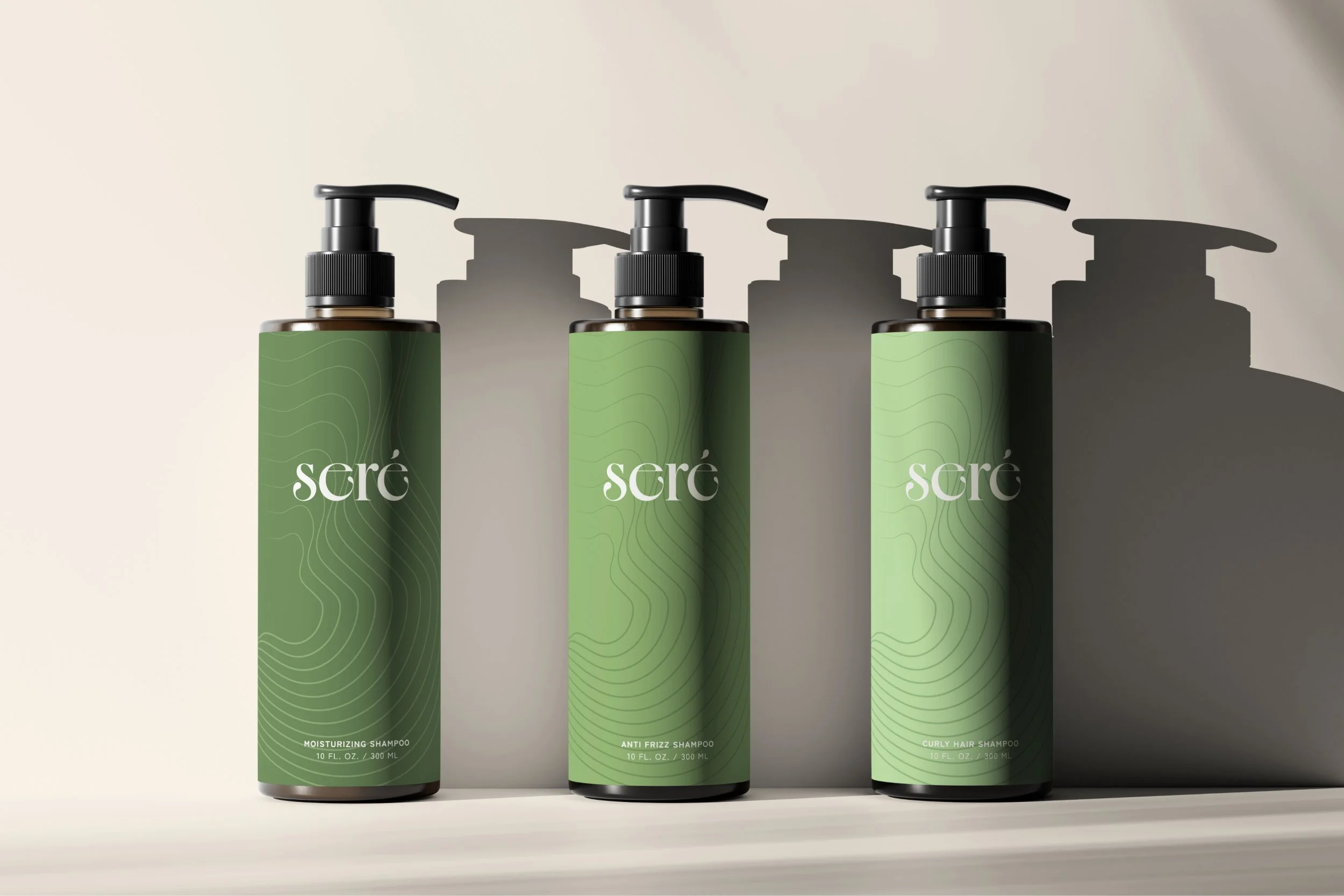
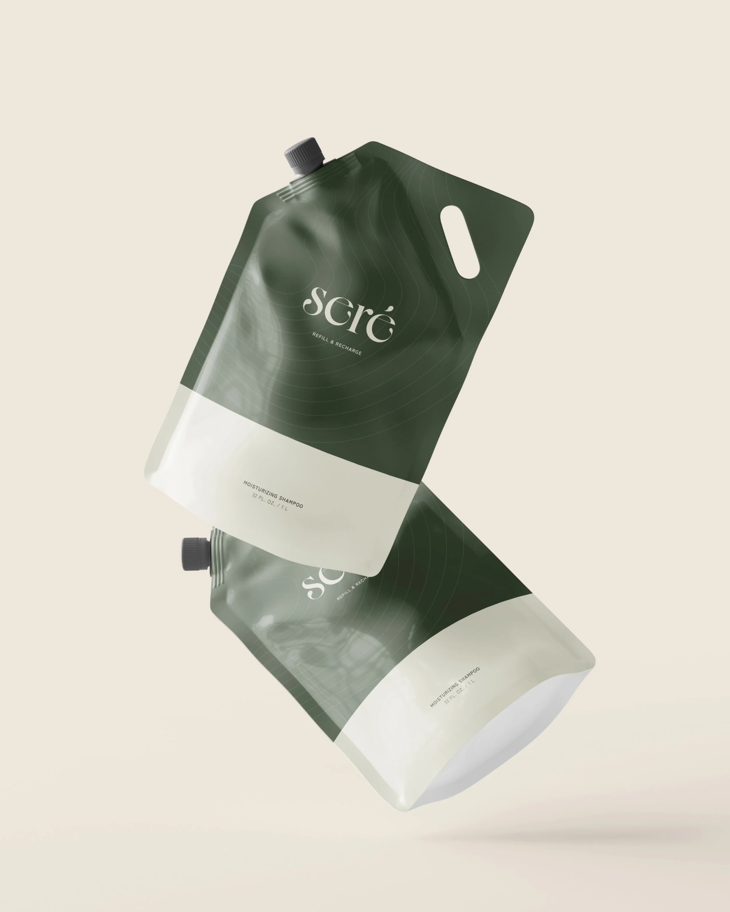
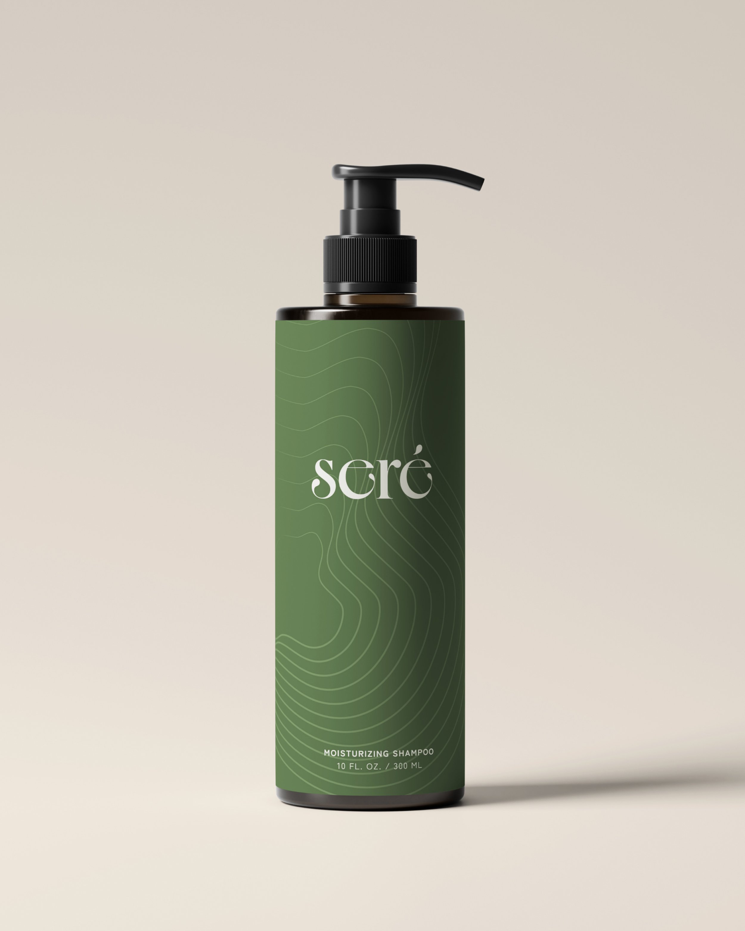
Package Design
Visual Direction
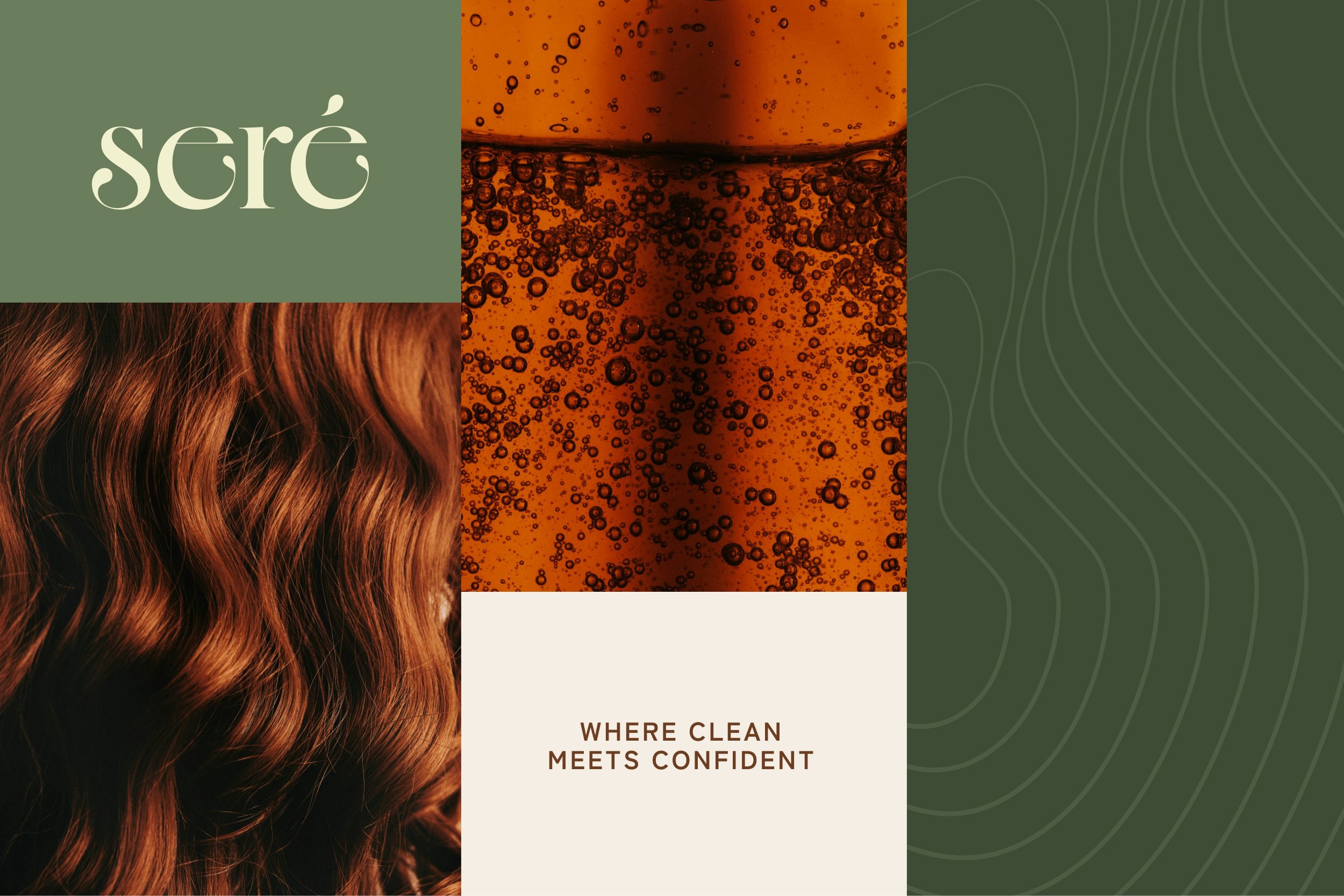
SERE
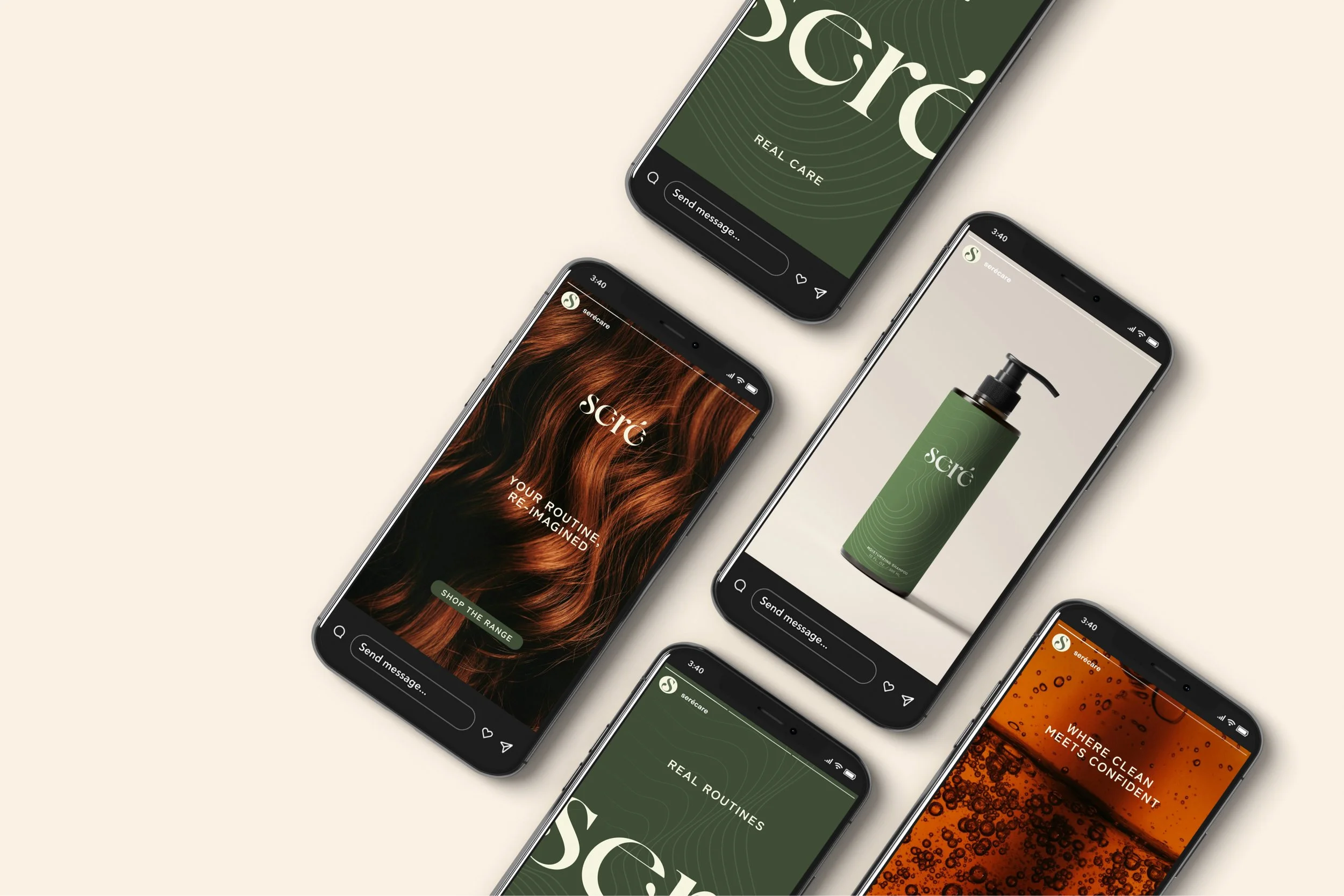
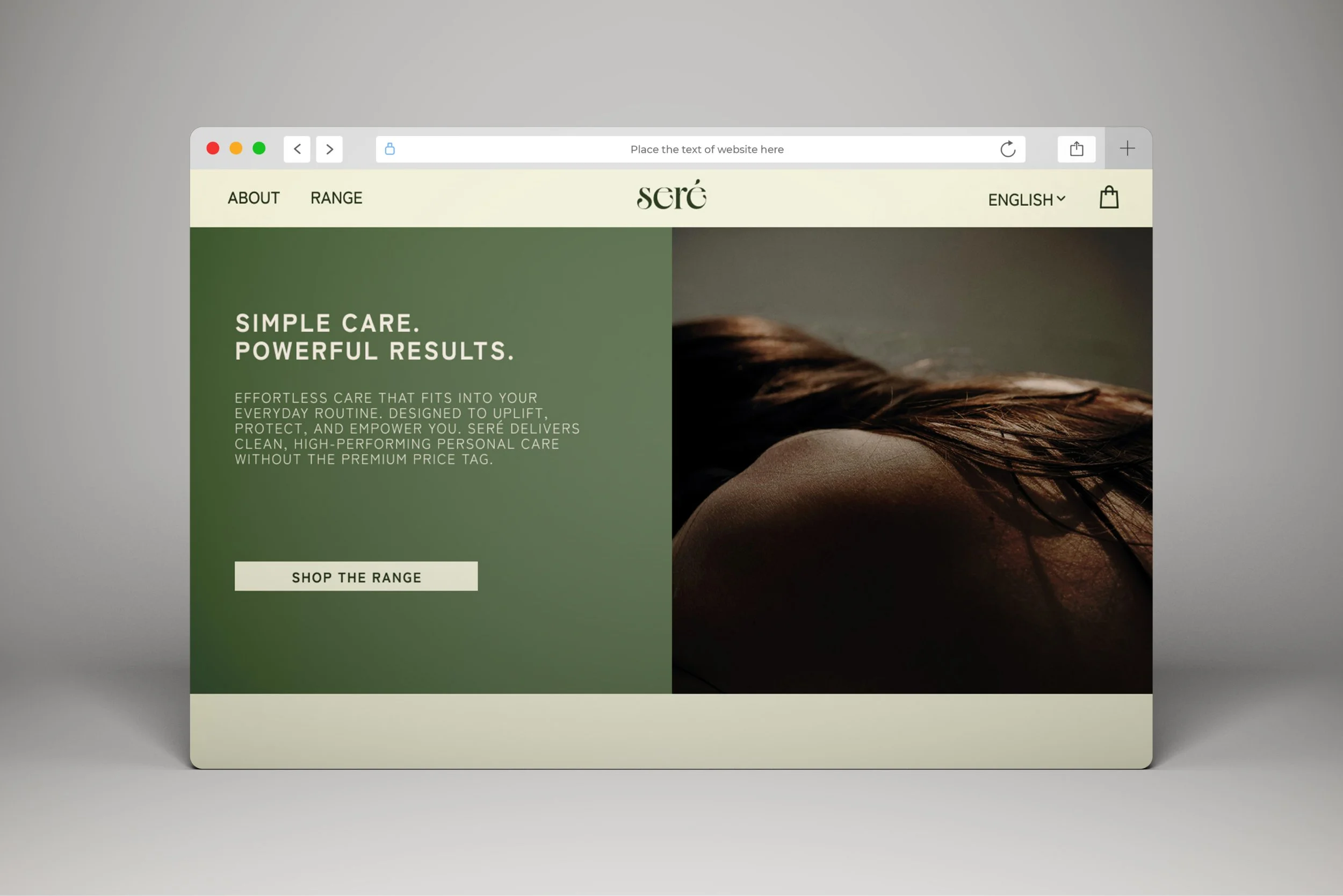
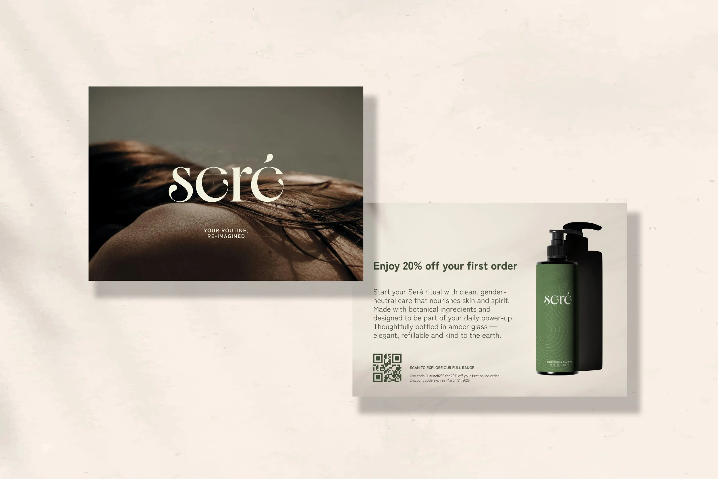
Seré is a rebrand of Suave, a traditional drugstore haircare brand, reimagined to feel more modern, inclusive, and intentional. The goal was to transform a dated and generic identity into one that prioritizes everyday empowerment through thoughtful design and accessible self-care. Inspired by clean beauty trends and minimalist wellness brands, the visual direction features a warm, gender-neutral palette, amber glass packaging, custom iconography, and soft editorial typography. The rebrand explores how simplicity and authenticity can feel luxurious without losing its mass appeal.